Leafly Editorial Illustrations
Leafly Editorial Illustrations
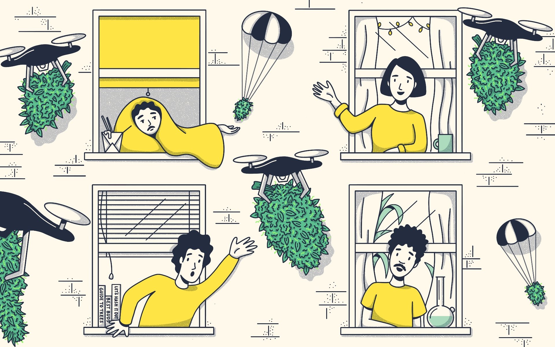
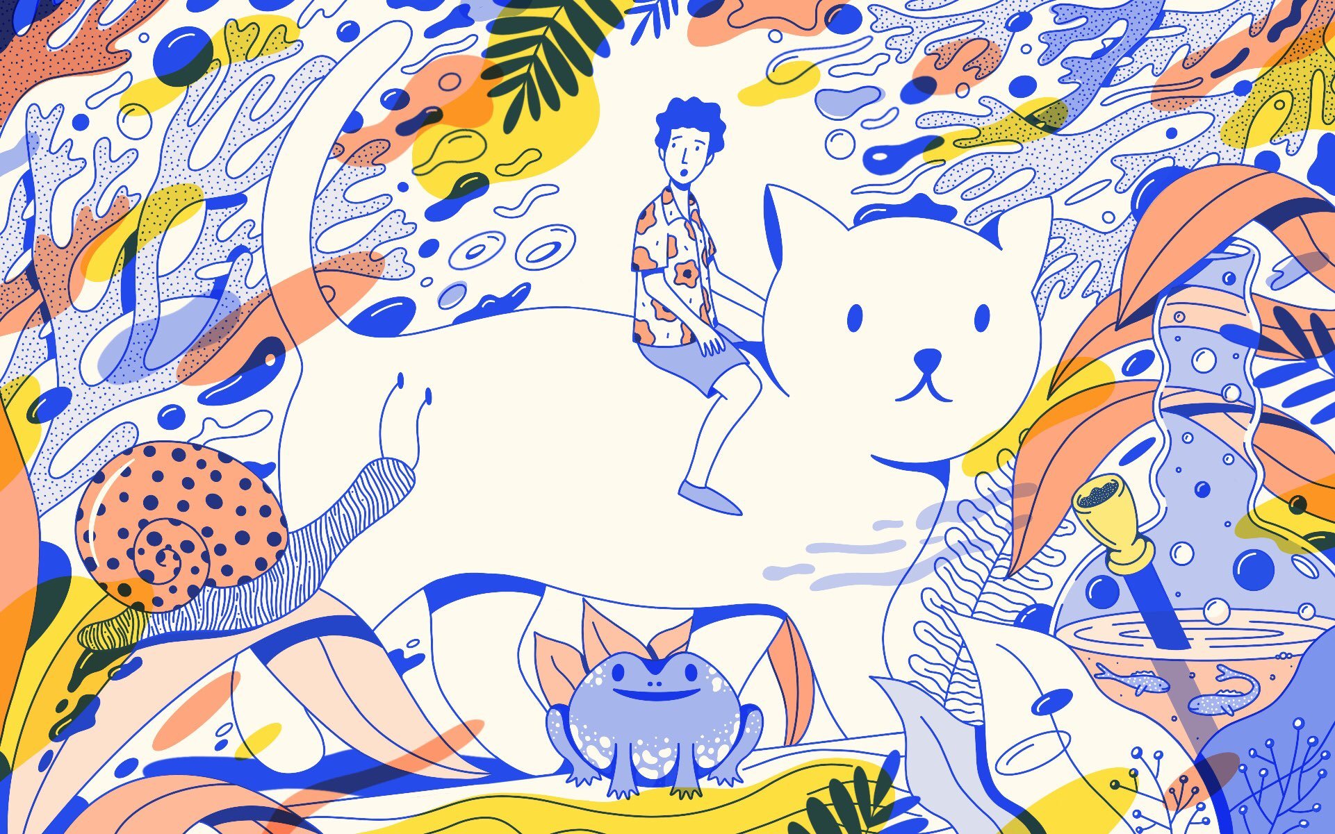
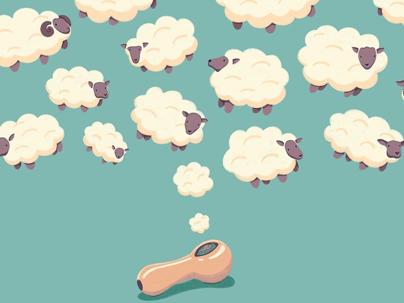
In July of 2018, I began working with Leafly to create illustrations for web. For each assignment, I am given an article to read and research, and from there, I brainstorm a concept for a header and/or body graphic, and execute it through illustration. Leafly is the largest cannabis website in the world, with over 13 million monthly visitors and 40 million pageviews across its website and mobile applications (I stole this factoid from Wikipedia). They are also kind of a dream client, because the super talented art director, Julia Sumpster, allows me to explore different visual styles and mediums for each assignment.
The Smuggle is Real
For an article on cannabis smugglers, I was asked to illustrate three (in)famous people who were involved in illicit marijuana trade. I saw this as a fun (and slightly stressful?) challenge, as I don’t consider myself much of a portrait illustrator. My prompt for this assignment was, “less cute, more badass.” I worked on many iterations using my go-to painty tools, and nothing was really feeling right. I went back to the drawing board and looked through some of my older work for inspiration, and that’s when I had the idea to use simple shapes similar to my animal illustrations. I went with a simplified yet bold three-color palette using different opacity levels to create depth. I decided not to add any grain or texture, but to highlight the images with soft, fluid lines.
Header image.
Trippy , Bro.
My first set of illustrations was for an article titled Healing With the Psychonauts: Psychedelic Medicine Goes Mainstream. This was a really fascinating read, as I'm new to the world of micro-dosing, and the concept of using psychedelics to treat a wide range of medical issues from PTSD to autoimmune disorders. For my header image, I was directed to "not go too far into Yellow Submarine territory, but a hint of it would be okay."
For the body image, I decided to illustrate an early 1960s scientist experimenting with LSD. I found images of 1960s labs and lab coats to create a historically accurate illustration, and I looked to Mad Men for hairstyle and glasses inspiration.
Beantown's Exclusion Problem
My next assignment came in hot with just a week to complete. Usually that's no big deal for me, I can work fast under tight deadlines. But this article, titled In Massachusetts, ‘Local Buy-In’ Leaves Equity Candidates Outside, Waiting was a bit more challenging than usual. I was directed to use Boston as a backdrop for this image, but that was a bit of a conundrum for me because Boston isn't the most distinctive city. Don't get me wrong, it's beautiful, but it doesn't have an instantly recognizable skyline, and I didn't really want to include illustrations of the Boston Tea Party or the Red Sox (Go Yankees, Go Knicks, Tom Brady sucks, etc.). Plus, I wanted to create a strong visual metaphor for the racism and classism that is hurting so many small business people in the city. I worked through many iterations for this illustration, and ultimately settled on the concept of a POC business man being excluded from the old boys club at the top (literally, they're hanging out on roofs). I included simplified versions of the Old North Church and the Longfellow Bridge for those familiar with Boston architecture. I also included the magical swan boats that have dotted the pond of the Public Garden for over 140 years.
Various Articles
Qualifying Conditions for Medical Marijuana Cards by State
Qualifying Conditions by State


