

Case Study: Seattle Target Mural
In the Beginning, There Was an Email
Early on a Saturday morning this past May I received an email from a creative producer at Target headquarters announcing an exciting opportunity to create a mural for the new Target store in the Ballard neighborhood of Seattle. According to the email, their art directors had researched several artists from the Seattle area and I had been selected!
As I blearily skimmed the email over my first cup of coffee, my initial reaction was basically:
Like, of course, obviously, this was clearly a scam. But why would someone go through the trouble? Was my arch nemesis from elementary school playing some kind of sick prank thirty years later? So I did some good old LinkedIn snooping and began to realize that this email might be legit. And then I began to freak out.
First of all: what?? They wanted ME? Who even am I? At the time, I was less than a year out of school, and while I had done a bunch of work for Leafly.com, I felt very much like a tiny designer living in the suburbs and flying under all the cool radars. Could I do a mural? Wouldn’t it suck? What if I had a mental breakdown during the process and it ended up being half-finished and then I was publicly shamed? What if I accidentally drew a lot of penises in it and didn’t notice until it was finished, and the community was outraged and children weren’t allowed to view it? At the same time, I was SO EXCITED. I had no idea what the scope of the project would be, or how my design would be used, but it was an insane opportunity, and deep down I knew I was up for the challenge. I wrote back to the creative producer and let her know UH YES PLEASE I WILL DO THIS.
Getting Started
In the coming weeks, I had several phone meetings with Cara, the creative producer, and Ed, my art director. They were immediately so nice, and they made it clear that they wanted me to create something that I would be happy with. They sent me the creative brief, and we talked about the theme and tone. They wanted something friendly and playful, colorful and engaging. They showed me a few examples of my past work that they liked.

They also sent me a rough sketch of the space in which I’d be designing. The initial wall size was 9’x22’, and I’d have to think about what color I wanted below the mural (Target red or gray).

A Bit About Ballard
For the theme, Target wanted to pay homage to old Ballard, which is known for its Scandinavian heritage and its history as a hub for crusty old fishermen. When I first moved to Seattle 12 years ago, Ballard was, in many ways, still a quiet working class neighborhood filled with industrial warehouses, a super cool bowling alley, and divey bars populated by rough old fishermen and broads named Bev. I liked the idea of incorporating aspects of old Ballard into the design, but I wanted to be mindful of how the neighborhood had changed.
In recent years Ballard has become sort of a microcosm of the whole city, where older businesses have shuttered to make way for sleek condos and deconstructed coffee bars, and home-owners clash with underserved populations struggling to survive in an increasingly unaffordable city. Locals might not respond positively to a large chain store displaying a mural of “old Ballard,” especially when that store is being built in a space that was once home to the legendary Sunset Bowl. I was also wary of including human figures in the mural, because I wanted to be inclusive, and I knew that no matter what I did, I would inevitably leave someone out. I always want to show diversity in my illustrations, because we live in a diverse world. Seattle unfortunately has a super racist history of displacing and segregating people. I worried that if I tried to rewrite a very white history, the image might feel disingenuous or pandering. I also thought about incorporating references to the Duwamish people – the indigenous peoples of the Seattle area who have inhabited this land for thousands of years – but as a white lady, that didn’t seem like my story to tell.
Puget Sound
I thought about what I really love about this region, and about Ballard itself. I realized that when I think about quintessential Ballard, the story that I’d like to tell is one about the inhabitants of Puget Sound. Allow me to now briefly segue into some nerd stuff about Puget Sound that I think is really cool:
Puget Sound is an inlet of the Pacific Ocean that was created by several ice sheets retreating and advancing into the region over time. About 15,000 years ago the last ice sheet eroded the land to make the Puget Sound we have today. It has an average depth of 450 ft, with its deepest point at 930 ft. The Sound is surrounded by two amazing mountain ranges – the volcanic Cascade Range in the east and the rainforest-covered Olympic Mountains in the west. The Sound is home to islands, fjords, tidal flats, rivers, streams, and estuaries. It is also home to an abundance of flora and fauna, including orcas, salmon, porpoises, sixgill sharks, seals and sea lions, octopi, crabs, anemones, sea slugs, kelp forests, geoducks, and so much more. It’s one of the most magical places I’ve ever known.


The Ballard neighborhood is unique because of its relationship to the Sound and its marine life. You can watch the salmon run at the Ballard Locks and hear the sea lions barking from the beach at Sunset Gardens. You can sail out from the Ballard Marina and race along the waves with harbor seals and bald eagles. You can breathe in the low tide at Golden Gardens and examine the rocky shore while you search for sea stars and anemone. This is the story I wanted to tell in my mural, and my art director signed off on it.
Initial Sketches
I began by doing research on the flora and fauna of the area, and practiced sketching plants and animals. The Encyclopedia of Puget Sound was a great resource for images and info. I learned so much about the ecosystem here!
Sketches done in Procreate.

Seaweeds and a crabby.

Water surface exploration.
I started sketching the main design with a June 30th deadline for final deliverables in mind. I did all of my drafts in Procreate. Early on, I wanted to incorporate every animal I could. I also wanted to include the Olympic Mountains, which can be clearly seen from the Sunset Hill neighborhood in Ballard. At first I was really worried about accuracy. Seattleites can be real sticklers, and I worried that if everything didn’t look just-so, they’d be pissed that I did a bad job of representing their neighborhood. So every mountain peak was defined, and while the sea life was stylized, I was focused on accuracy.
Very first draft with color concept based on Target Red.
First draft feedback.
Iterations 4-EVER
During the first draft process, I learned that the space for the mural was going to be much bigger, so in my second draft, I added a second scene to fit into the new space.

Second draft with expanded wall size. I went a lil crazy on detail!
Playing with color a bit. I actually built this out in Illustrator, because I was that confident that this design would be approved lol
My initial sketches were presented in a meeting with Target executives in Minneapolis, and they were like

(image from my Salty Sticker Pack for Snapchat!)
They wanted more playfulness. It was also too busy. They wanted the animals to be cuter. They pointed out that the salmon looked like they were in agony, which was fair, because salmon usually are in agony (they have really hard lives). This feedback was super helpful, because it made me realize that I didn’t have to focus on accuracy, and I could actually have some fun with this. My next round of illustrations looked like this
Ed suggested that I scale back and just focus on one part of the wall to set the overall composition theme. I still really like those rolling mountains.
Color exploration.
These illustrations were presented to the executives again, and again they said no. They wanted more whimsy, and they wanted texture. Our deadline of June 30th had passed, but they didn’t seem to mind, so I just kept going. I submitted new sketches and they were still like
Nice try, dingus!
Be More Whimsical, Dammit!
My art director Ed was going on vacation, so his art director, Ted (Ed and Ted), took on the case. Ted gave it to me straight:
WE NEED MORE WHIMSY.
At this point, I was so stuck on what the mural had looked like in my head for the past two months that I couldn’t see anything else. What even was whimsy?? Was I capable of whimsy?? How do I do it? Will they fire me? Should they get another illustrator? I was super stressed. I had been working on the mural like all day every day for weeks, and my brain was possibly broken. I had a coffee date scheduled in the following days with my former colleague, mentor, and kindred spirit, Amy.

Beautiful, kind, perfect Amy.
An inspiring book by Carson Ellis! I got my copy at Third Place Books.
I thought about canceling because I was so overwhelmed, but my husband encouraged me to go, saying it was OK to take a break from work, and seeing Amy might help me get out of my head a bit. It turns out that chatting with Amy was exactly what I needed. Not only was it great to catch up with her and hear about her new life as a therapist-in-training, but she brainstormed with me and helped me come up with a bunch of ideas for whimsical illustrations (she has a lot of experience with being magical because she is a mom and also she is naturally very magical). We browsed Third Place Books in Lake Forest Park, and she recommended this wonderful book for some extra inspiration:
I’m Back, Baby!
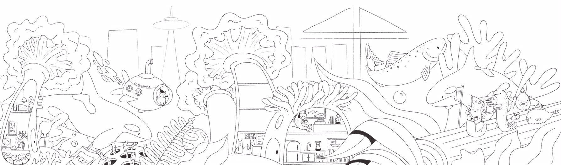
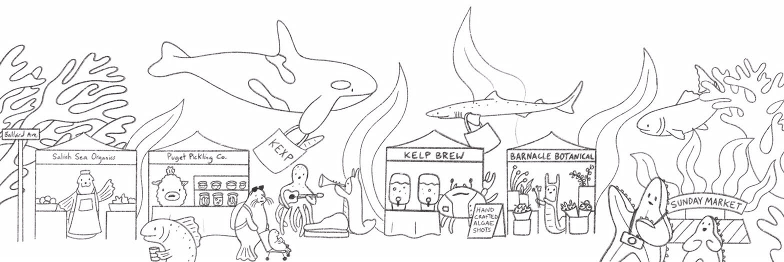
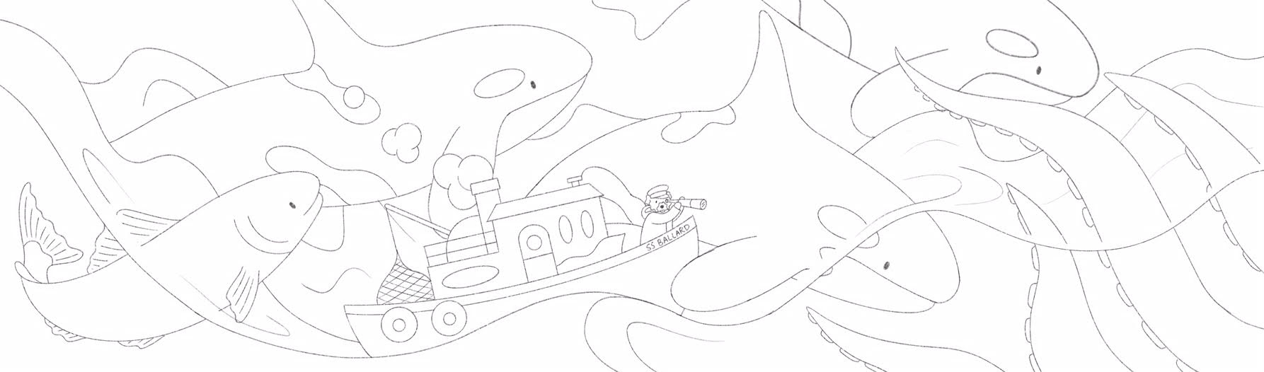
Feeling reinvigorated with my new ideas percolating, I came up with three new concepts to send to my art directors. My first sketch was Seattle reimagined under Puget Sound, complete with cranes, commuters waiting for the 44 Bus to/from Ballard (known as the 44ever), a kelp bar, and a cool fish making coffee in his Chemex and listening to records. The second sketch depicts the Ballard Sunday Market with vendors, shoppers, and tourists. The final sketch shows massive Orcas surfing the waves with a fishing boat piloted by a sailor dog.
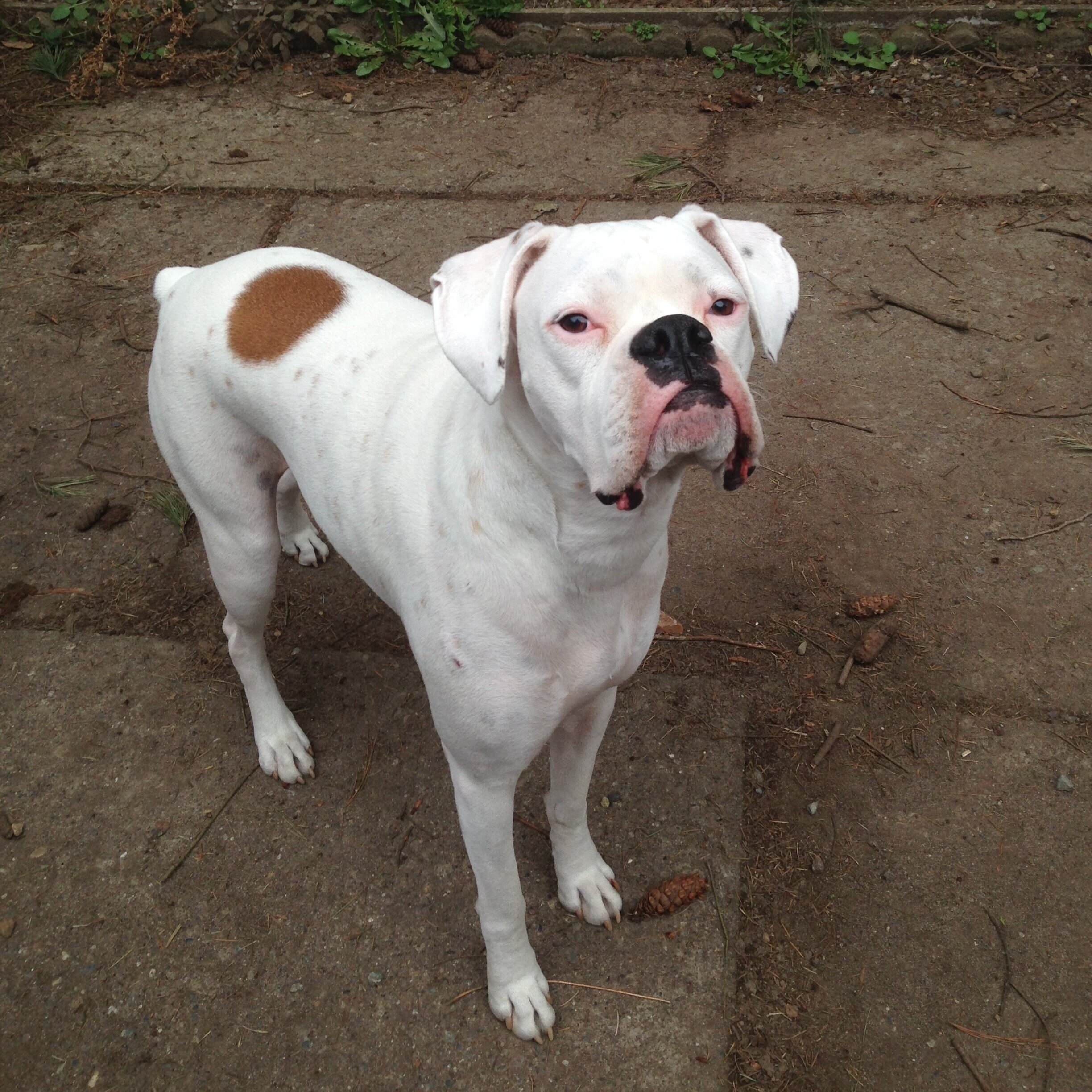
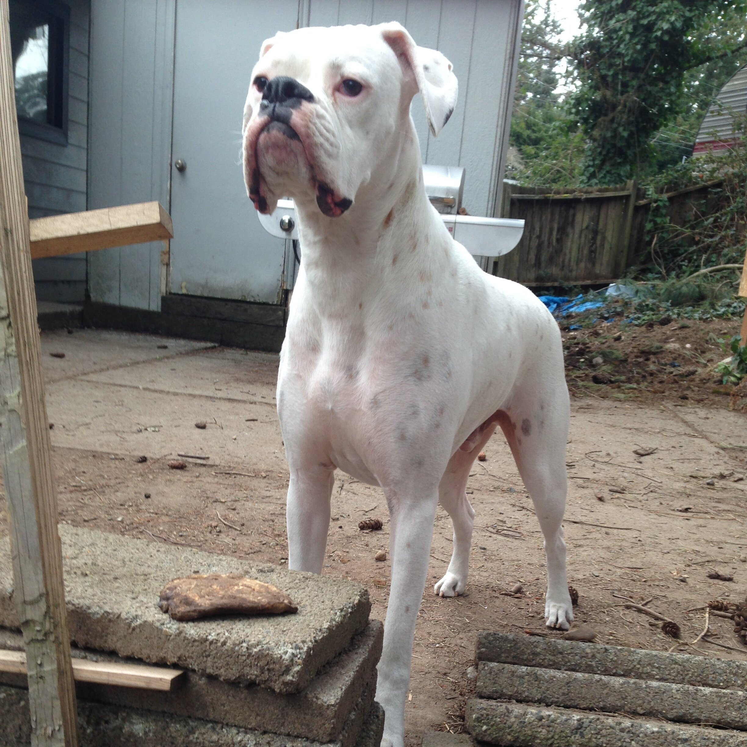
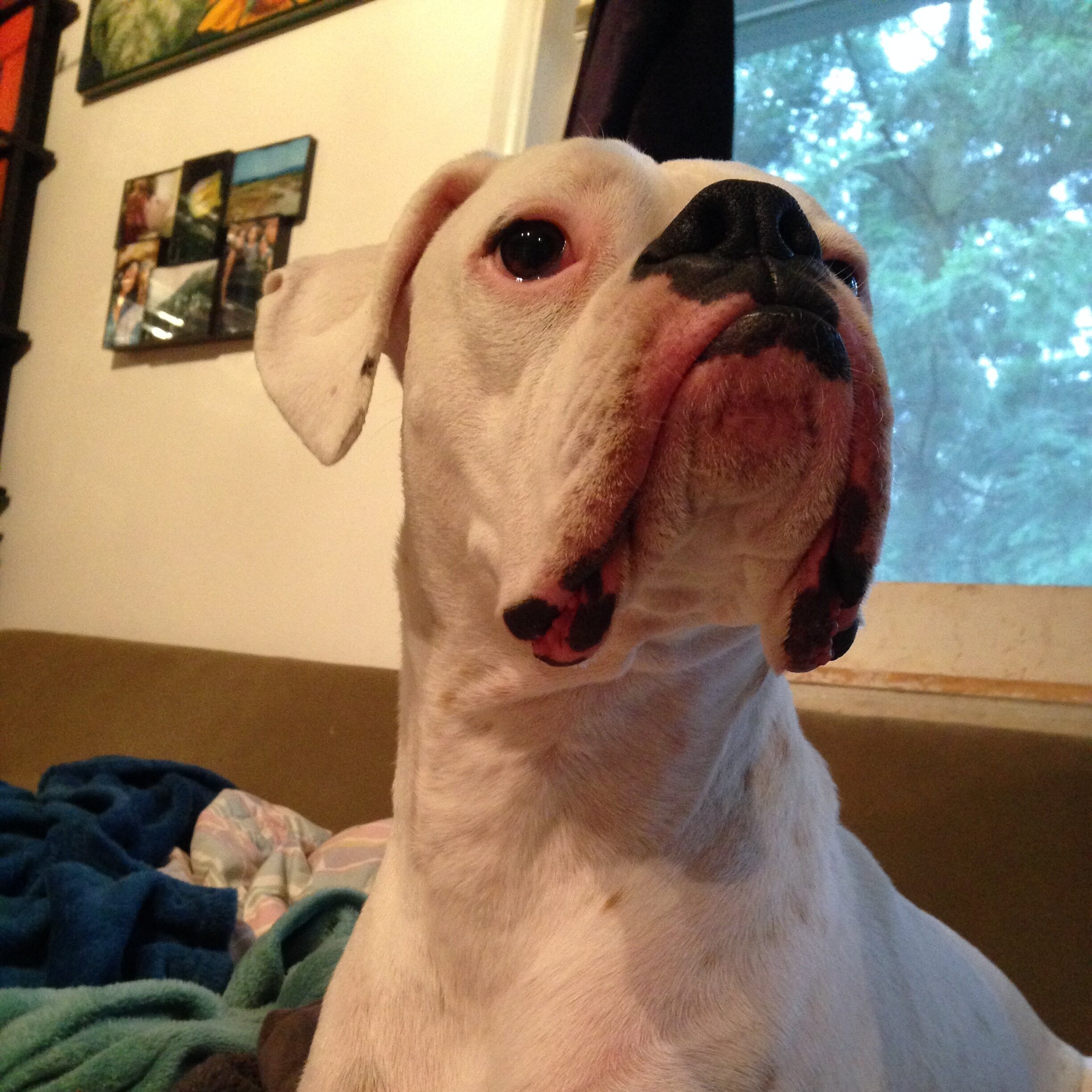
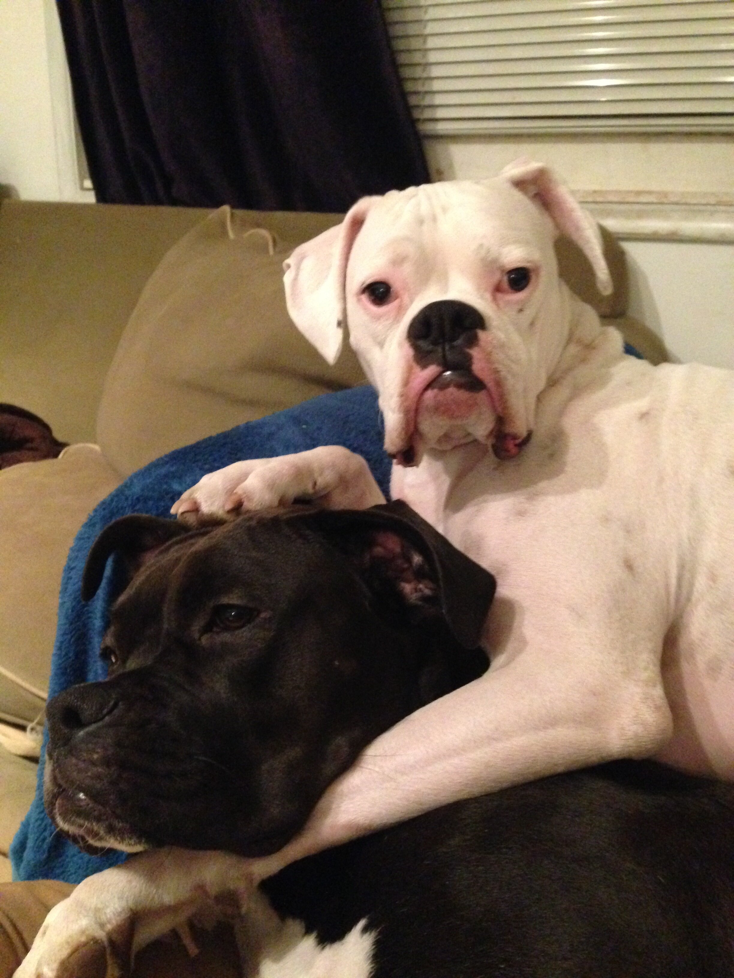
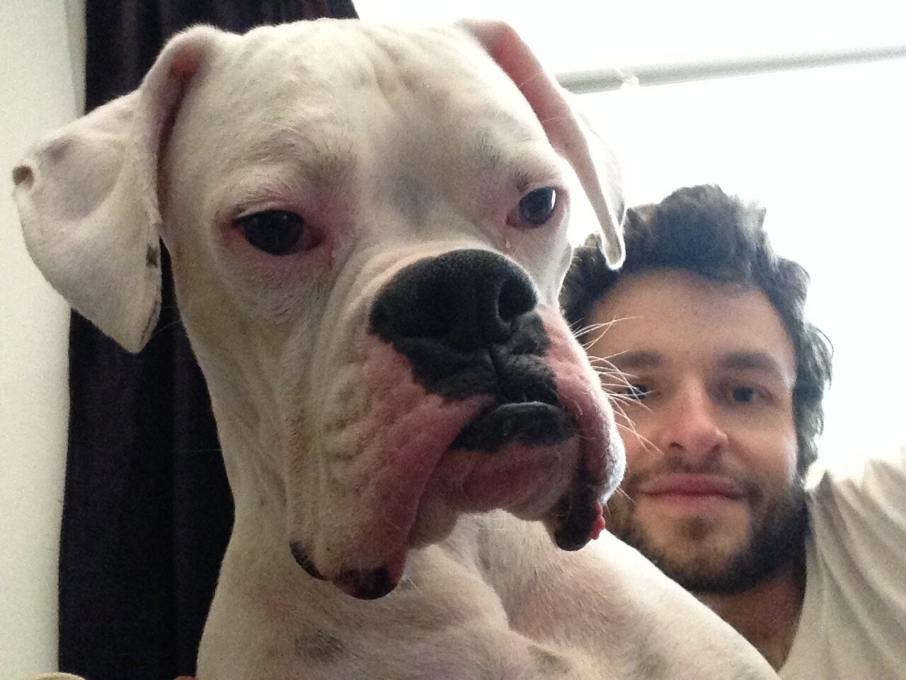
And my art directors loved them! We picked out features from each and refined the final design a bit more. I also changed the cat in the submarine to a dog, because Seattle is for dog lovers (we love cats too, but dogs run this town). My husband is a dog walker, and I used one of his clients as my model. He is a boxer named Ralph and he is preposterous (and he was adopted in Ballard!). Here’s Ralph and his sister Shelby being TOO MUCH:
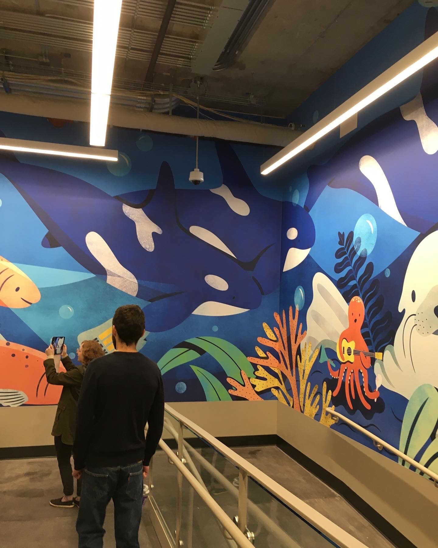
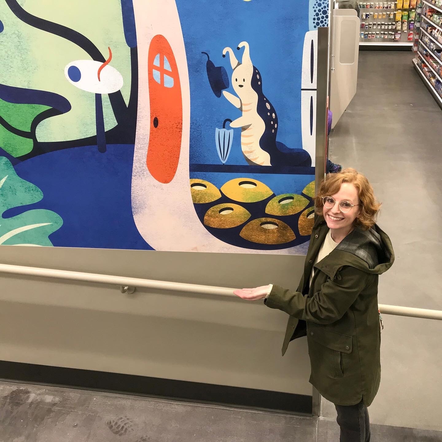
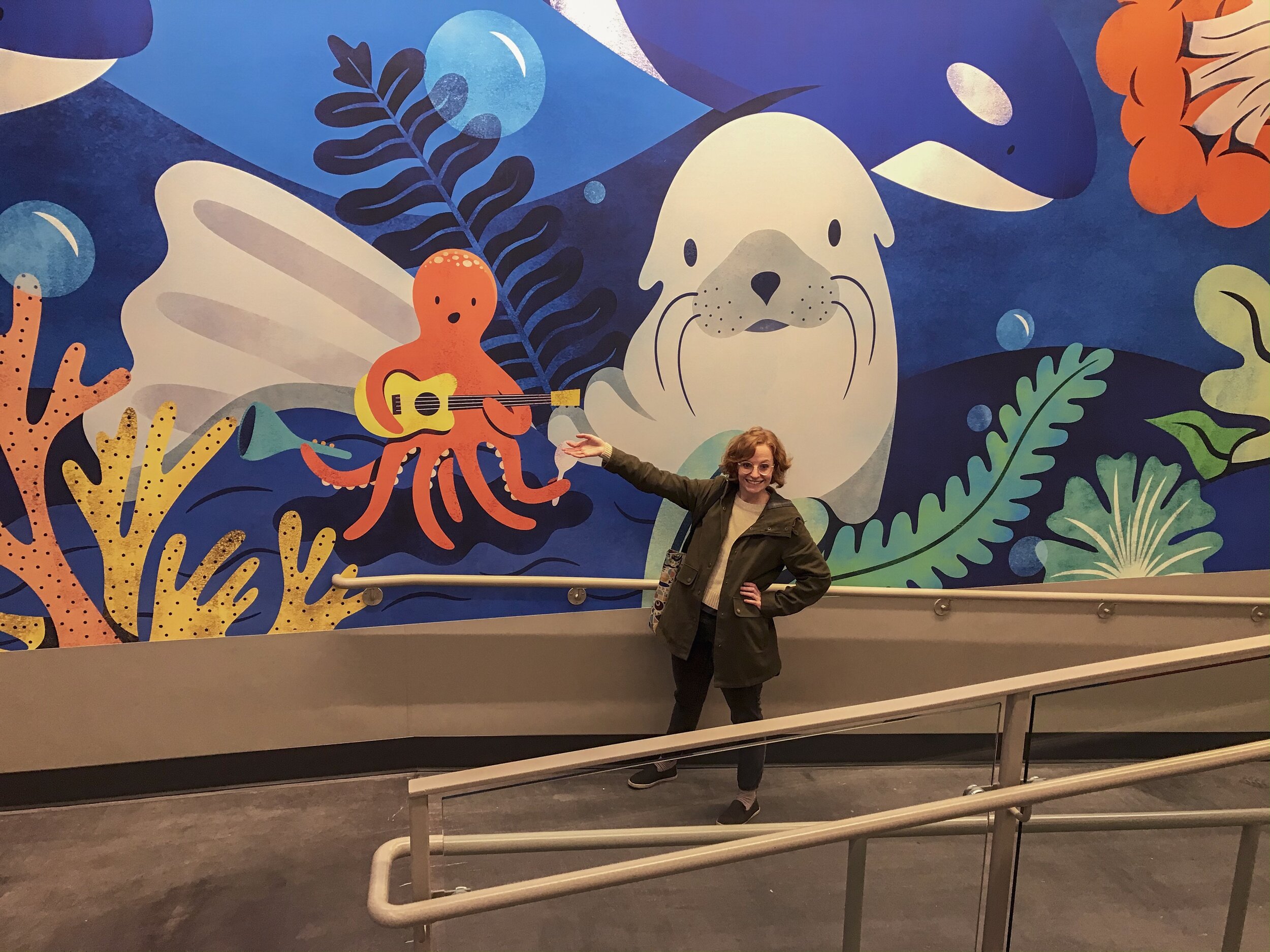
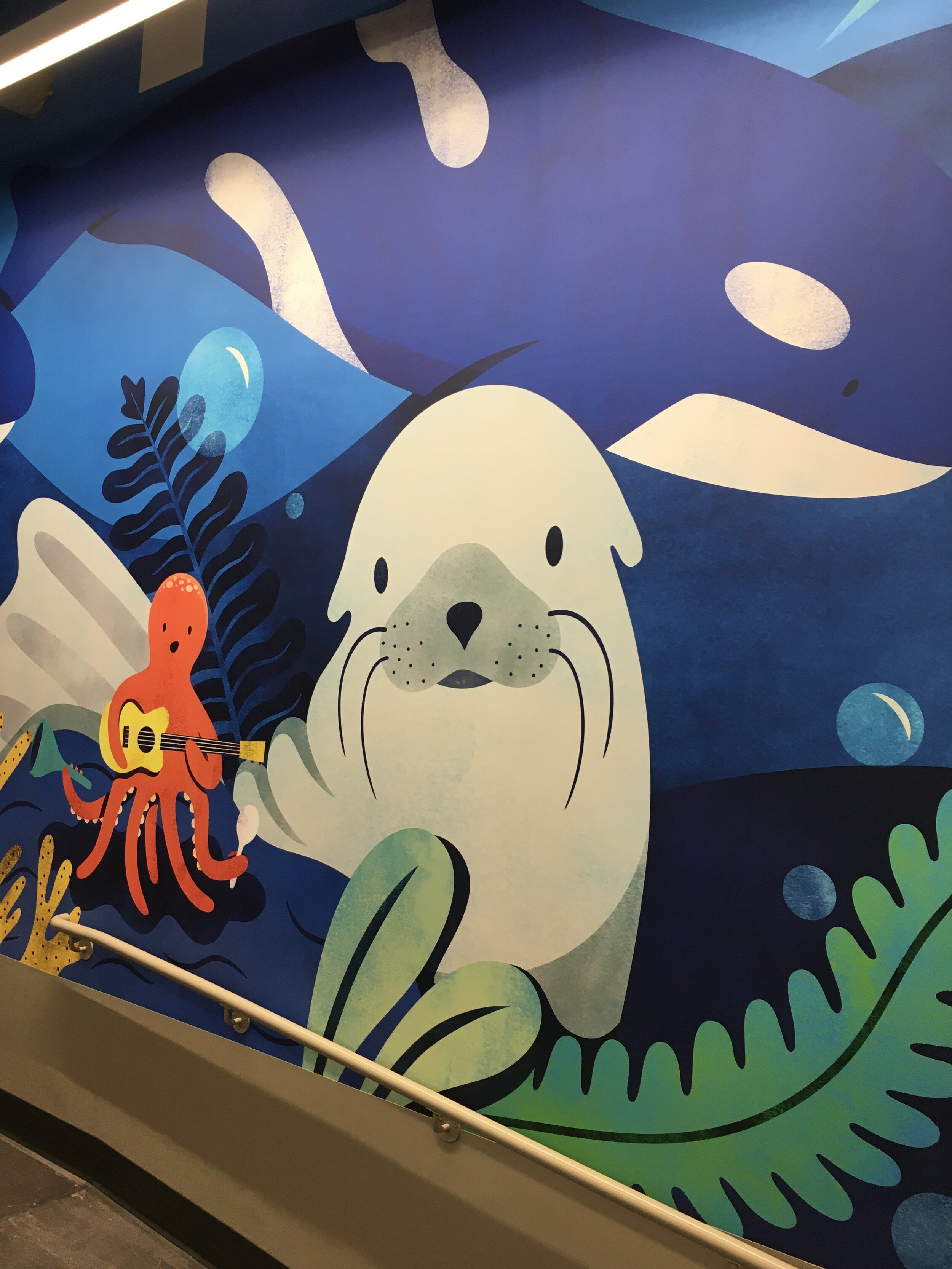
Here’s the final composition we landed on. The crab on the left is a remnant of my original sketch, but he’s been updated to be much friendlier than the crab from before. I wanted to incorporate a beloved Seattle institution into the illustration, so I went with KEXP, which is the best radio station in the world. I used the busker octopus from my farmers market sketch, and gave her an audience with the sea lion. On the far right is a sea slug starting his day. He lives in a plumose anemone which is native to the Puget Sound waters. I gave Ralph a little beanie to pay homage to Jacques Cousteau and Steve Zissou (I also thought all of the Seattle design hipsters who wear beanies would like it!). Finally, I drew a school of friendly salmon who live idyllic lives and hopefully never have to swim upstream to die.
The Super Computer
I could get to work on the final illustration, but there was one big problem. The executive in charge of this project wanted my illustration to be textured like this:

I love this style, but the issue was that I had created this illustration in Adobe Photoshop as a raster image. If you’re unfamiliar with that term, a raster image is an image that can’t be made bigger without losing quality and getting blurry and pixelated. Whereas a vector image is one that a designer builds in Adobe Illustrator, and the image can be scaled bigger or smaller without losing any quality. It had been understood from the beginning that the mural would be a vector illustration, as that was the standard format for all Target murals. But in order to achieve the texture from my earlier bear illustration, I would need to use Photoshop. This is challenging, because the more objects and textures added in Photoshop, the bigger the file gets, and the slower your computer will run. The final mural size was huge, but luckily Ed split the full image into two separate files. But even then, my computer just couldn’t handle it. Every time I attempted a brush stroke, my computer had to think for 10 minutes. It eventually came to the point where I could no longer save the file. I contacted Adobe support, but they said I probably needed a bigger, faster computer. It was now early August, and Target needed the file ASAP. I decided I was screwed.

Shout Out to Andy at Rent A Computer
But then my art director suggested that I rent a super computer! I did some research and found an awesome company out of Ohio called Rent A Computer. I worked with a very nice and knowledgeable Account Manager named Andy, who helped me choose the right computer for my needs, and within a few days, a big fancy $12,000 Mac Pro was at my door. The new computer enabled me to work much more quickly, and I was able to modify some of my favorite Kyle T. Webster brushes to use on a very large scale. His brushes only go up to 5000 pixels, so I had to really play around with grain and scattering and blending modes to achieve my desired texture. I ended up building all of my objects in Illustrator, and then bringing them into Photoshop to texturize. I used my Wacom bamboo tablet to create all of the texture in the image. Color sort of fell into place as the project progressed. I will sometimes start an image with a specific palette in mind, but in this case I just kept adding more and more colors until it all clicked for me. I had given myself ten days to complete the final file, and I finished the project late the night before I had to send the computer back. After months of hard work, my final design was complete!
It’s done!!!!
Target was happy with the finished illustration, and I repurposed the image to design reusable bags that would be given out at the store grand opening.
Ralph’s on a bag!
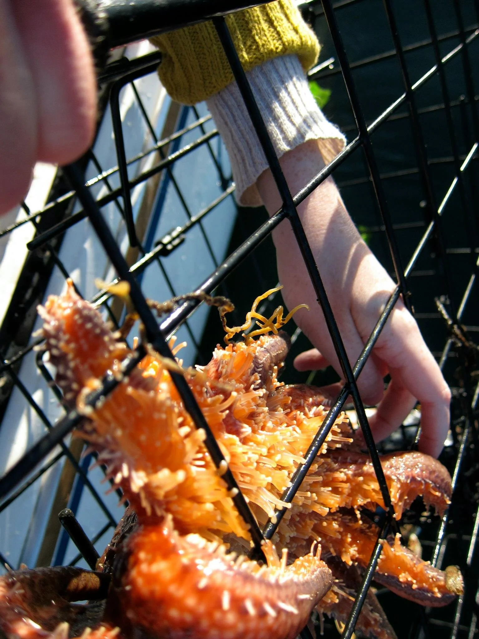
In the weeks that followed, I got updates on the mural installation. One really awesome aspect of this project was that I didn’t have to install the mural myself! Target had it printed on vinyl wallpaper, which is great, because I’m very short and it would have taken me several years to paint the whole thing! Here’s what they sent me in September so I could get a look at the process and understand the scale.
![IMG_2652[1].JPG](https://images.squarespace-cdn.com/content/v1/5888e38c5016e1cb209f0709/1573164349684-855VQAAF683LFZNB43SH/IMG_2652%5B1%5D.JPG)
Wowee!
Phew!
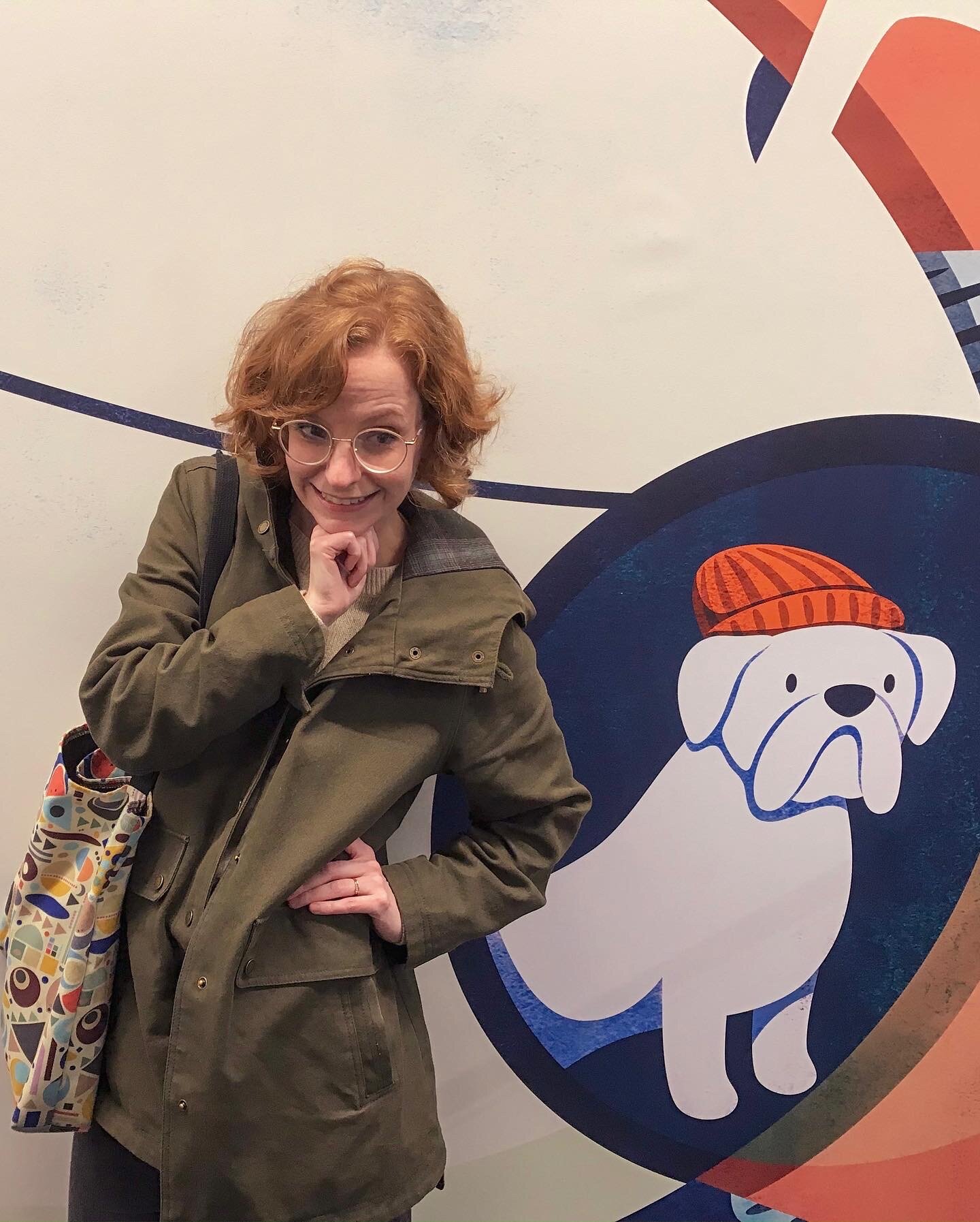
This week I got to visit the new location and see my mural in the wild. It was pretty overwhelming (literally!). It was surreal to see my work displayed on such a large scale, in such a permanent way. I am so proud of this project and all of the work that went into it. I’m excited for people to see it and feel a little spark of delight. I imagine little kids interacting with the musical octopus, and Pumpkin Spice Latte gals taking cute selfies with the sea lion. This project took about four months start to finish, with the bulk of the illustration work taking about two months. I only included some of my iterations in this write up, because I figured that adding them all would get repetitive. I learned early on that Target discovered my work through my dribbble account. I was compensated $20k for the mural and tote bag design. The computer rental was paid for by Target.
This was an incredible experience, and I still kind of can’t believe that I got the chance to work on this. I learned so much about designing for large spaces, working with a corporate client, and the technical side of building a huge raster file. I am so so grateful to Target for choosing me to work on this, and I’m also so thankful that I decided to respond to that initial email even though I was convinced it was a scam.
One Last Thing
When I was little, one of my favorite books was Miss Rumphius by Barbara Cooney. It’s the story of a woman called the Lupine Lady. When she was a little girl, her artist grandfather told her that whatever she did with her life, she had to do something to make the world more beautiful. She grows up and travels the world. She meets amazing people and has magical experiences, and she eventually settles in a small village by the sea. As an older woman, she realizes that she still hasn’t figured out how to make the world more beautiful. One day she begins scattering flower seeds around town. Over time, the whole village is covered in lupines, delighting her neighbors and inspiring children in the village to follow in her footsteps and grow more flowers. She’s found a way to give the world something beautiful.
For years I didn’t know how I could make the world more beautiful. When I went back to school for design, I had no idea where my path would take me. But now I’m about to finish my first year as a full-time freelance illustrator, and I have never been happier. Making art for a living is a dream come true, and I truly never imagined that I’d be in this place. Every day I get to do what I love, and just by making art, I also get to make the world a little more beautiful. It’s a pretty sweet deal.
Fall, 2018.